Equity Multiple Redesign: Enhancing Discoverability and Trust in FinTech Resources
Redesigning the Resources Center for Equity Multiple to Improve Content Access and User Trust
Redesign
Fin-Tech

Role: Product Designer
Duration: 4 Weeks, 2020
Company: Service Channel
Overview
Equity Multiple, a FinTech platform connecting accredited investors with commercial real estate opportunities, needed a redesign of their resources center to improve usability and content discoverability. The goal was to provide investors with easy access to educational resources tailored to their preferences and needs.
Equity Multiple, a FinTech platform connecting accredited investors with commercial real estate opportunities, needed a redesign of their resources center to improve usability and content discoverability. The goal was to provide investors with easy access to educational resources tailored to their preferences and needs.
Problem
The existing resources center had a high bounce rate, poor discoverability, and limited filtering options, making it difficult for users to find relevant content. Users also lacked trust in article sources due to repeated stock images and unclear distinctions between different types of content (e.g., Press vs. Articles).
The existing resources center had a high bounce rate, poor discoverability, and limited filtering options, making it difficult for users to find relevant content. Users also lacked trust in article sources due to repeated stock images and unclear distinctions between different types of content (e.g., Press vs. Articles).
Solution
I led the redesign by conducting usability testing, facilitating brainstorming sessions, and creating high-fidelity wireframes. The new design introduced:
Enhanced Discoverability: Various filter options tailored to users’ preferences and knowledge levels.
Improved Credibility: Author bio pop-ups to establish trust and differentiate between content types.
Personalized Content: Suggested articles based on recent trends and user behavior.
Visual Consistency: Introduction of unique visuals and an intro video to engage users and provide clarity on available resources.
Results
Increased User Engagement: The redesigned resources page made it easier for users to find and trust content, leading to higher engagement.
Scalability: The design approach was scalable, accommodating future content and feature expansions.
Navigating Ambiguity: Successfully managed challenges with limited initial data by pivoting to complementary user research, ensuring actionable insights were gathered.
Research
To identify the key pain points of Equity Multiple's resource center, I conducted usability testing with existing users and reviewed existing user interview data. There was gaps in research, so I pivoted to include complementary users with experience in various types of investments. This approach provided valuable insights into the discoverability issues, filtering limitations, and credibility concerns that informed our redesign strategy.
To identify the key pain points of Equity Multiple's resource center, I conducted usability testing with existing users and reviewed existing user interview data. There was gaps in research, so I pivoted to include complementary users with experience in various types of investments. This approach provided valuable insights into the discoverability issues, filtering limitations, and credibility concerns that informed our redesign strategy.

User Persona
Experimentations Explored
I conducted usability testing with five users to identify pain points on the existing site. Key findings included confusion due to the use of the same stock images for different articles, difficulty distinguishing between Press and Articles, and limited filtering options that didn’t align with user preferences, all of which hindered their ability to effectively find resources.
I conducted usability testing with five users to identify pain points on the existing site. Key findings included confusion due to the use of the same stock images for different articles, difficulty distinguishing between Press and Articles, and limited filtering options that didn’t align with user preferences, all of which hindered their ability to effectively find resources.

Filtering articles was very limiting and didn't give users filtering options that fit their preferences
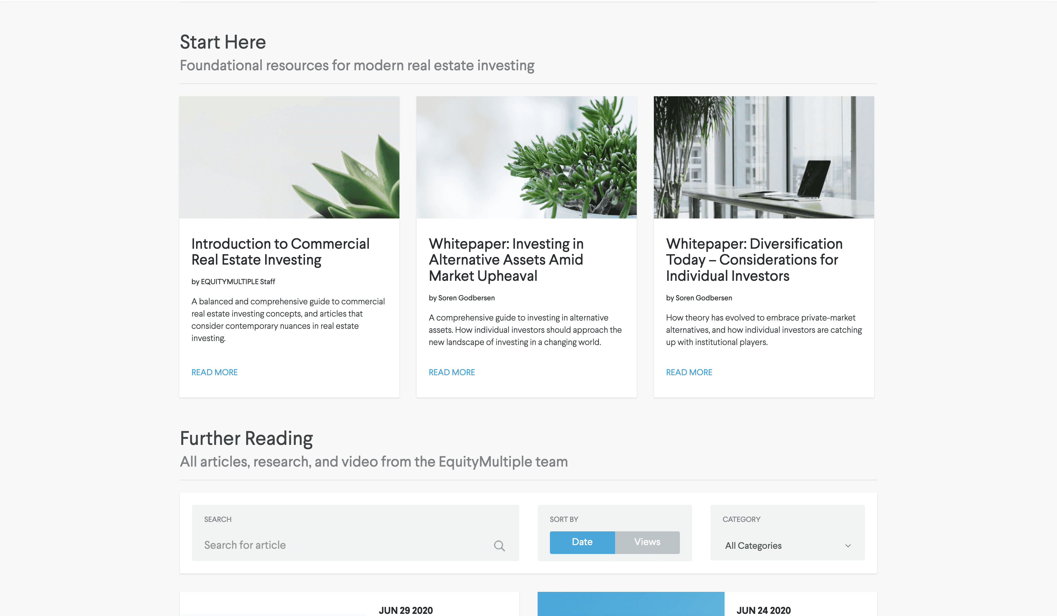
Stock images were used for different articles, which made users doubt the validity of the sources

Users didn't trust the sources of the articles, or whether it was a good article to read
Filtering articles was very limiting and didn't give users filtering options that fit their preferences
Stock images were used for different articles, which made users doubt the validity of the sources
Users didn't trust the sources of the articles, or whether it was a good article to read
Filtering articles was very limiting and didn't give users filtering options that fit their preferences
Stock images were used for different articles, which made users doubt the validity of the sources
Users didn't trust the sources of the articles, or whether it was a good article to read
Filtering articles was very limiting and didn't give users filtering options that fit their preferences
Stock images were used for different articles, which made users doubt the validity of the sources
Users didn't trust the sources of the articles, or whether it was a good article to read
How Did I have an Impact?
Prototype
I significantly improved user experience by enhancing content discoverability, trust, and usability. I addressed major pain points through strategic user research and effective design solutions, such as personalized filtering options and author bio pop-ups. My efforts resulted in a more intuitive and credible resources page, boosting user engagement and supporting business goals.
I significantly improved user experience by enhancing content discoverability, trust, and usability. I addressed major pain points through strategic user research and effective design solutions, such as personalized filtering options and author bio pop-ups. My efforts resulted in a more intuitive and credible resources page, boosting user engagement and supporting business goals.
Quantitative metrics that I would measure to Indicate success:
Bounce Rate
Before vs. After Redesign, Measure the percentage decrease in bounce rate after implementing the new design.
Click-Through Rate (CTR) on Suggested Articles
CTR Increase, Measure the increase in clicks on suggested articles, indicating improved content relevance and discoverability.
Filter Usage Rate
User Engagement with Filters, Monitor the percentage of users who utilize the new filtering options, showing the effectiveness of these tools in helping users find relevant content.
Scroll Depth
Engagement with Content, Track the scroll depth to see how far down the page users go, which can indicate higher engagement with the content.
Other Project’s


