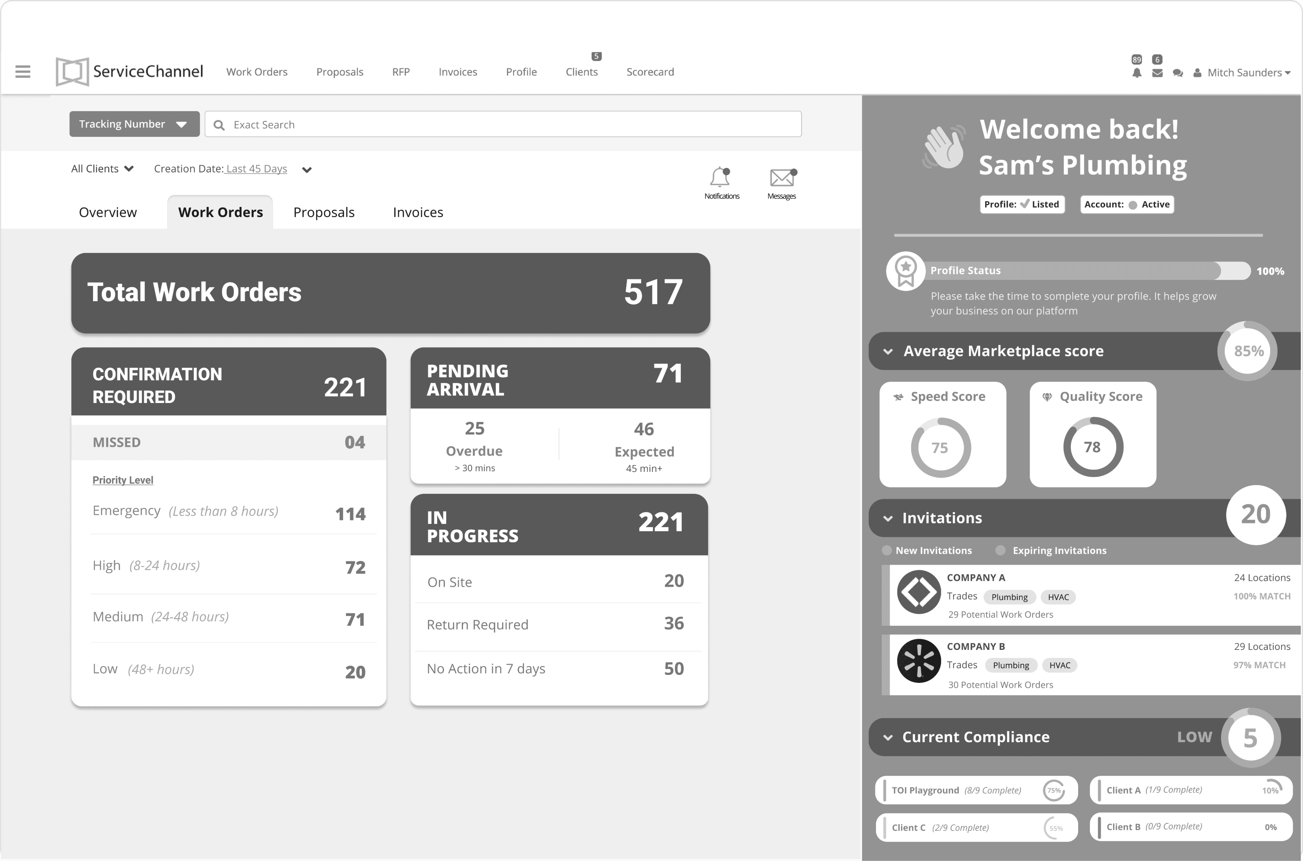
Provider Dashboard Redesign: Streamlining Workflow Management at ServiceChannel
Transforming a Complex Interface into a Seamless Experience: How We Doubled User Adoption and Enhanced Efficiency for Thousands of Service Providers
Web Design
Redesign
Role: Lead Growth Designer
Duration: 12 Months
Company: Service Channel
Overview
Problem
Solution
Results
Increased user adoption from 32.82% to 65.38%, securing a 1.5% revenue stream for ServiceChannel. Users reported saving 30–40 minutes daily with the new provider dashboard, enhancing customer satisfaction, retention, and overall workflow efficiency.
Project Context
ServiceChannel 101
Service Channel User Flow
Service Channel is a marketplace with two primary users: The Subscriber and The Provider. The Subscribers are multi-locations that you commonly know, like, Chipotle, Louis Vuitton, etc. They purchase SC as their facility management software. The providers offer services like plumbing, repair, maintenance, etc.
Designing for Clarity & Efficiency
We focused on simplifying the dashboard's complexity without sacrificing its power. Key improvements included:
1. Workflow Management
A dashboard that shows all the most frequent action items in one place to navigate faster and have a high-level summary of the workflow.
2. Marketplace Score
Overall summary of their score to understand how clients see them in the marketplace and show recommendations for Improvement.
3. Invitations from Clients
Showcase prospective clients and potential opportunities with that clients, a way where they can get more work opportunities.
Before/ After Re-Design
Research & Explorations
Common Themes that arose in Research
Experimentations Explored
Design Trade-offs
Simplicity over complexity .
Chose a simpler design to minimize development time, despite knowing advanced features could better meet user needs.
Standardization over customization.
Opted for standardization to speed up development, rather than customization for specific user needs.
Performance over aesthetic details.
Prioritized system performance, ensuring visual changes didn't negatively impact user interaction and responsiveness.
Future Vision
How Did I have an Impact?
As the Lead Product Designer, my impact in “Workflow Provider Dashboard” include:
Increased User Adoption
Secured Revenue Stream
Enhanced User Satisfaction
"Having this detailed home page saves me 30-40 minutes every morning. I remind my technicians to view the homepage everyday to stay organized, the homepage is one of the best improvement to the SC Provider platform”
-DeWayne Durr
BME, National Accounts Relationship Manager
“The new homepage is straightforward and much easier to use. If I need to navigate to WO’s in a specific status I can easily click on the number. I love the new layout because I can see everything I care about in one place”
-Tatiana Enriquez
RESSAC Climate Control, Account Coordinator
Streamlined Workflow Management


